Analytics
This section provides details on how to interpret the analytics and Journey utilization reports.
The insights provided by Analytics are crucial for monitoring the performance and efficiency of Journeys.
✅ Prerequisites
- Basic understanding of Quickwork terminologies and familiarity with Quickwork's GUI.
- Understanding the basic principles of automation, including triggers, actions, and the concept of automated Journeys.
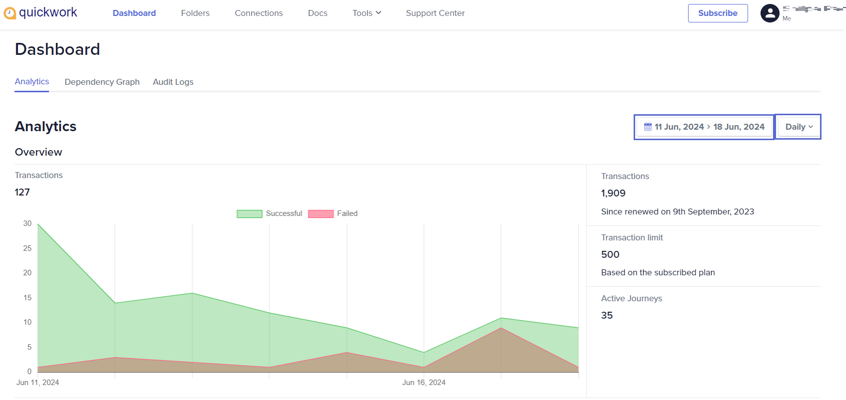
Analytics overview
- To access Analytics, navigate to the Dashboard tab.
- Customize the date range for the displayed data by selecting the desired timeframe at the top-right corner of the dashboard.
- Choose from Daily, Monthly, or Hourly intervals to tailor the information according to your specific needs.
- Transactions: Visualize the total number of transactions over the selected timeframe, broken down into successful and failed attempts. The transactions are represented in a graph with dual-color coding: green for Successful and red for Failed transactions. Placing the cursor on a specific time frame displays a tooltip of the metrics of that particular day/hour/month.
- Key indicators:
-
Transactions: This number represents the total transactions processed by the system since the last renewal date.
-
Transaction limit: This indicates the maximum number of transactions allowed under the subscribed plan. It is a cap set based on the specific subscription plan you have chosen.
-
Active Journeys: This shows the total number of active Journeys currently running to run in your account.
-
Each of these metrics provides insight into the usage and limits of the service, helping you monitor your consumption relative to your subscription limits.
Journey utilization report
This report shows the distribution of transactions across the top 5 Journeys as per the selected date range in the top-right corner of the dashboard.
1. Transactions for the top 5 Journeys:
- This chart provides a clear, comparative view of Journey activities, highlighting differences in transaction volumes across various Journeys within the timeframe specified.
- Clicking on a row will direct you to the specific Journey.
- Clicking on the eye symbol on the Journey utilization report, toggles the visibility of the selected Journey in the Trend graph located on the right-hand side. This feature is useful for comparing transaction trends between specific Journeys while hiding those that are irrelevant for comparison.
2. Trend graph for top 5 Journeys:
- The graph visually represents the trend of transactions for each Journey over the specified timeframe. Each line corresponds to a color-coded journey as indicated on the left.
- The graph illustrates significant activity peaks and troughs, helping users quickly grasp when and how often each Journey was triggered.
- Placing the cursor on a specific time frame displays a tooltip detailing specific activity on that particular day/hour/month.
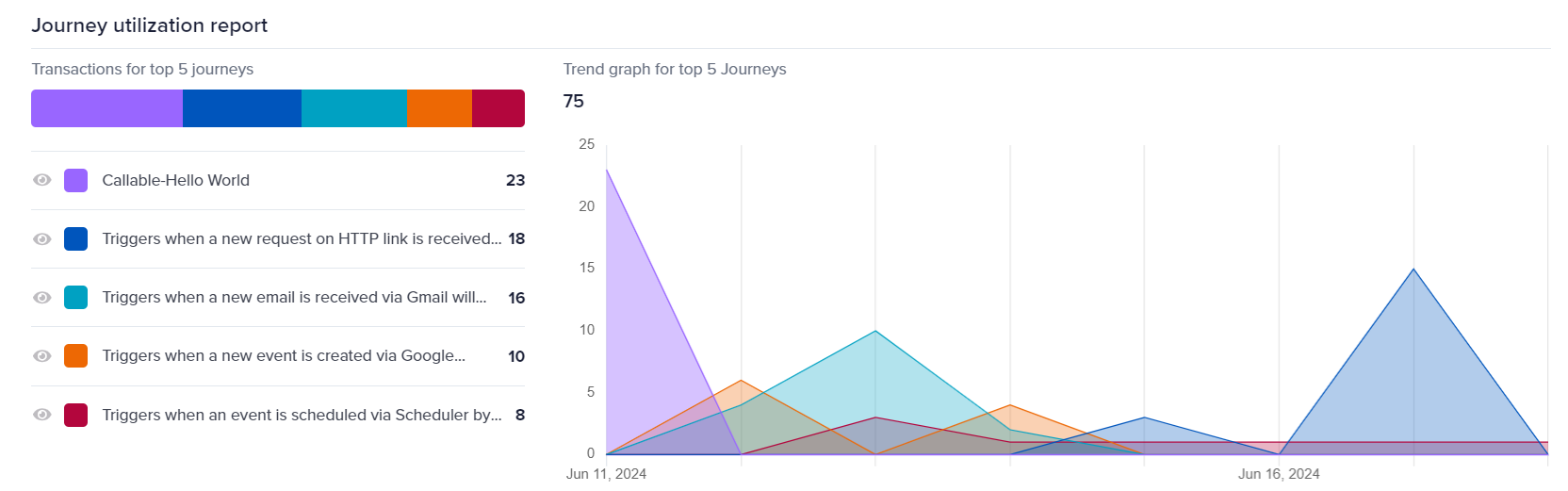
This type of reporting is crucial for understanding the demand and performance of automated processes within the platform, allowing you to make informed decisions about scalability, optimization, and potential bottlenecks in the automated Journeys.
All Journeys
Below the trend graph, a detailed table lists all Journeys in the selected date range in the top-right corner of the dashboard, with their respective success and failure counts. This table helps in pinpointing the Journeys that require optimization.
You can export the Journey-related data by clicking the Download button above the All Journeys table. This functionality enables you to extract detailed information about each Journey's performance, including successes and failures, in JSON and CSV formats.
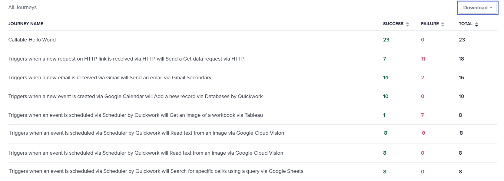
This exported data can be shared with all stakeholders involved, such as team members and customers, to facilitate collaborative analysis and decision-making.
❓ Troubleshooting
Failed to get transaction trends: Data can be aggregated based on the following time periods:
- Daily: You can aggregate data for up to 30 days. This period can be selected from any date range.
- Hourly: You can aggregate data for 7 days, which can be selected from any 7-day period.
- Monthly: You can aggregate data for 2-12 months, which can be selected from any 12-month period.
✏️ Tips and recommendations
- When examining analytics, make sure the date range selected accurately reflects the period you intend to analyze. Incorrect date ranges can lead to misinterpretation of data.
- Regularly monitor your transaction limits as per your subscription plan. If you notice unexpected failures in Journey executions, it might be due to exceeding these limits.
- Make use of tooltips in graphs for detailed insights on specific points.
- For Journeys with high failure rates, drill down into individual transactions to understand common points of failure or errors. This can help in pinpointing specific steps that require optimization.
📚 Additional resources
Transactions
Dashboard: Audit logs
Dashboard: Dependency graph